How should a digital assistant help you reserve a restaurant or send a text while you’re navigating heavy traffic? Can well-proportioned text and buttons add efficiency to a primarily voice-based interface without overly distracting a driver?
These are the kinds of questions I’ve been grappling with for over 20 years.
2000s
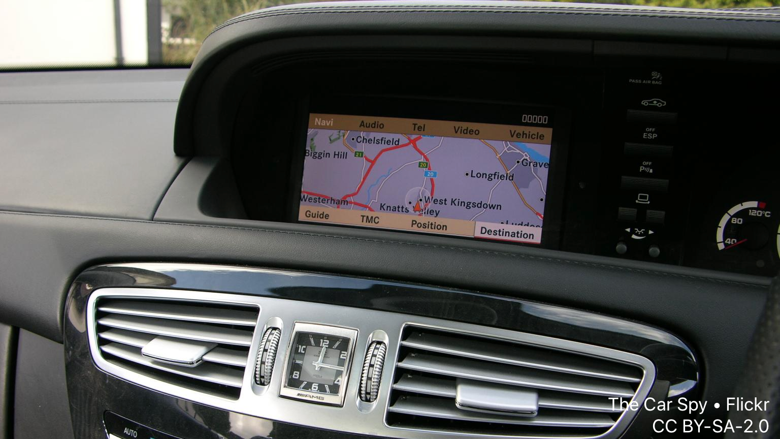
I started at speech recognition pioneer Dragon Systems, working in grammar design and localization for the voice-activated navigation system in the 2001 Jaguar X-Type. At Mitsubishi Electric Research Labs a few years later, I contributed to the navigation system for the 2006+ Mercedes C-Class. I also designed, built, and usability tested a series of voice and multimodal application prototypes targeting cars (see papers/patents here).
2010–2012
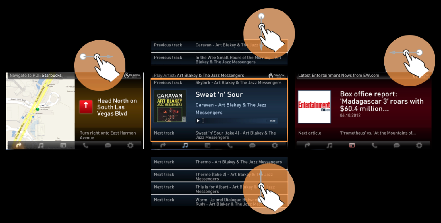
Later I served as the technical lead on a 5-person engineering team at Nuance, responsible for the Dragon Drive reference platform and demo apps. We developed a new interaction technique that allowed “no look” operation of touchscreens while driving. We called it Bullseye, because the whole screen acted as one big touch target.
"Bullseye" low-attention touch UI schematic
2013 onward
Upon moving to Apple in 2013 I became the Siri design lead for CarPlay. My pedigree and awareness of car UI/UX principles helped increase the credibility of the Siri design team within Platform Human Interface (HI). Contributions included high-fidelity (user test-friendly) multimodal mockups and prototypes of improved messaging and business search experiences. One small but important idea was my proposal to add a “more with Siri” button at the end of limited-length lists. (The CarPlay protocol gives manufacturers the option of forcing the Music app to show at most 10 items in lists.)
This “scoped Siri” button proved so useful that it’s since been moved to the top of Listen Now tab in the Music app. Maps and Messages also make use of this touch-then-speak interaction paradigm.